


In 2024, the MarketingProfs summary of Unbounce benchmarks reported a median landing page conversion rate of 6.6 percent across all industries. Behind that number sits a simple idea: a high converting landing page is a single purpose page that turns one specific visitor from one traffic source into one measurable action, such as a call, a form fill, or a booked consultation.
That median is useful, but it isn't a target for every business in the USA. The same page can do well from paid search and fail from social, because each visitor arrives with a different question, less patience, and less trust. A search visitor typed a problem into Google and wants an answer. A social visitor was scrolling, not shopping. A good page matches its source, keeps the promise made in the ad or link, and makes the next step obvious. When it does those things, fewer people need to think hard about what to do.
Table of Contents
- A Plain Definition and What Good Conversion Rates Look Like
- How a Landing Page Turns a Click Into a Lead
- Headlines and Calls to Action That Match the Click
- Trust Signals That Remove Doubt Before the Form
- Form Length and Mobile Design That Keep Visitors Moving
- Examples by Traffic Source and Common Misconceptions
- Optimization Checklist and Page Diagnosis
A Plain Definition and What Good Conversion Rates Look Like
Across 41,000 landing pages and 57 million conversions, analysts at Unbounce measured what real pages do. Their dataset makes one thing clear: most pages convert only a small slice of visitors, and the slice changes with the offer, the audience, and where the click came from.
A high converting landing page is a single purpose page that turns one specific visitor from one traffic source into one measurable action. That action might be a phone call, a form fill, a quote request, or a booked consultation. A page that asks for three different actions at once is built like a general website page, and it tends to convert like one.
The median works like the middle house on a street: half the pages convert better, half convert worse. In 2024, the MarketingProfs summary of Unbounce benchmarks reported a median landing page conversion rate of 6.6% across all industries, drawn from that dataset. The same year, Unbounce's benchmark report put ecommerce landing pages at a 4.2% median conversion rate and SaaS landing pages at a 3.8% median rate. Both sit well below the cross-industry figure, and both are ordinary for their categories.
| Benchmark | Median conversion rate | Source |
|---|---|---|
| All industries | 6.6% | Unbounce, 2024 |
| Ecommerce landing pages | 4.2% | Unbounce, 2024 |
| SaaS landing pages | 3.8% | Unbounce, 2024 |
How to read these numbers
Benchmarks describe crowds. Your page is an individual.
A rate near your industry median is ordinary. The page worth fixing first is the one sitting far below its own category and its own traffic source. Context decides what "good" means: a free checklist asks for almost no trust, while a consultation with a law firm asks for a great deal. The same page can also win from paid search and lose from social, because the visitors arrive with different intent. Someone whose AC just stopped working comes ready to act. Someone scrolling a feed needs more convincing before they hand over an email address.
Three signals tell you a page is built to convert regardless of the benchmark.
- A focused goal: One action matters most, and everything on the page supports it.
- A clear match: The headline continues the promise in the ad, email, or search result that brought the visitor.
- Proof near the action: The visitor sees a reason to trust you before you ask for contact details.
Practical rule: Judge the page against its own source and offer, and measure it against its own past performance before you reach for an industry number.
How a Landing Page Turns a Click Into a Lead
Think of a homepage as a shopping mall. It has many doors, many signs, and many places to wander. A landing page is a single door built for one visitor. That visitor walks through, sees one message, and reaches one clear place to act.
This diagram shows that single door path from click to lead.
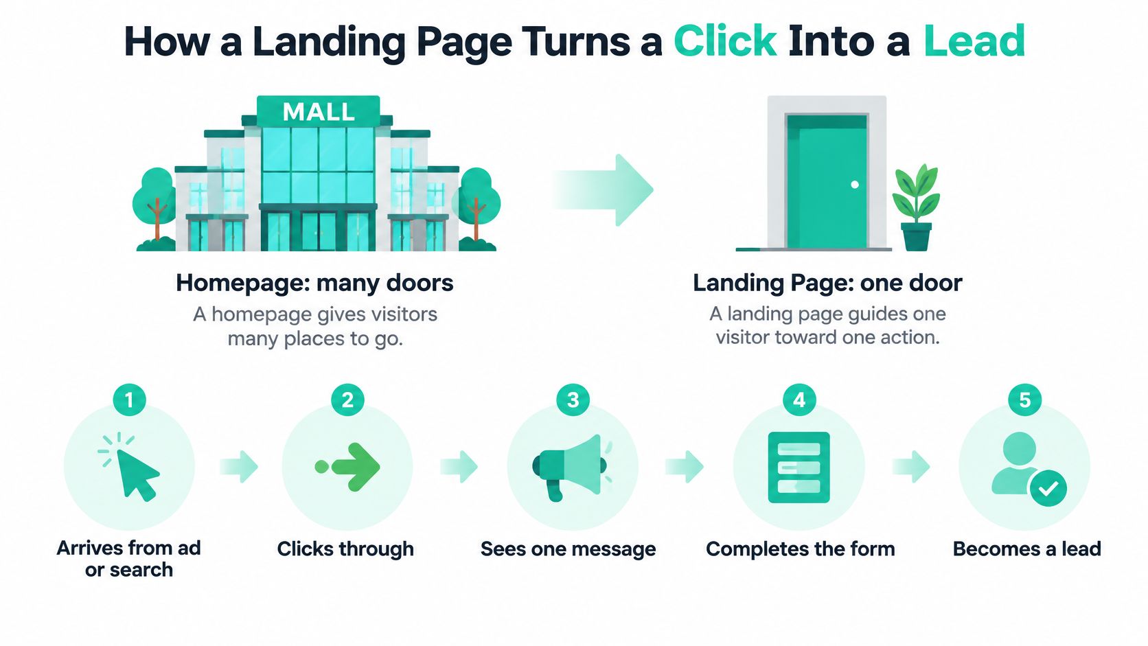
The four stages
Click. The visitor arrives from an ad or a search result. If the page loads slowly, many people leave before they see anything. Read. The headline needs to repeat the promise that earned the click. If it doesn't, the visitor feels tricked or confused.
Trust. A short proof section answers the quiet question, "Can I believe this?" That might be reviews, a license, or a clear process. Act. The visitor calls, fills out the form, or books. If that step feels risky or long, the lead is lost at the last inch. Those stages also explain why looking at examples of marketing funnels helps, because a landing page is only one step in a longer path to a sale.
Why speed and simplicity come first
The Google and SOASTA 2017 analysis of mobile landing pages found that as load time increased from 1 second to 10 seconds, the probability of a mobile visitor bouncing increased by 123%. It also found that when page complexity grew from approximately 400 to 6,000 elements, the probability of conversion fell by 95%. In that analysis, 70% of the mobile landing pages reviewed required more than 5 seconds to display above the fold visual content.
Those figures describe associations, not guarantees. Still, the lesson is plain. Remove anything that doesn't help the one action. Compress images, keep the top of the page light, and let the visitor reach the message fast.
Headlines and Calls to Action That Match the Click
This photo makes the match easy to picture, because the printed promise and the screen should feel like the same conversation.
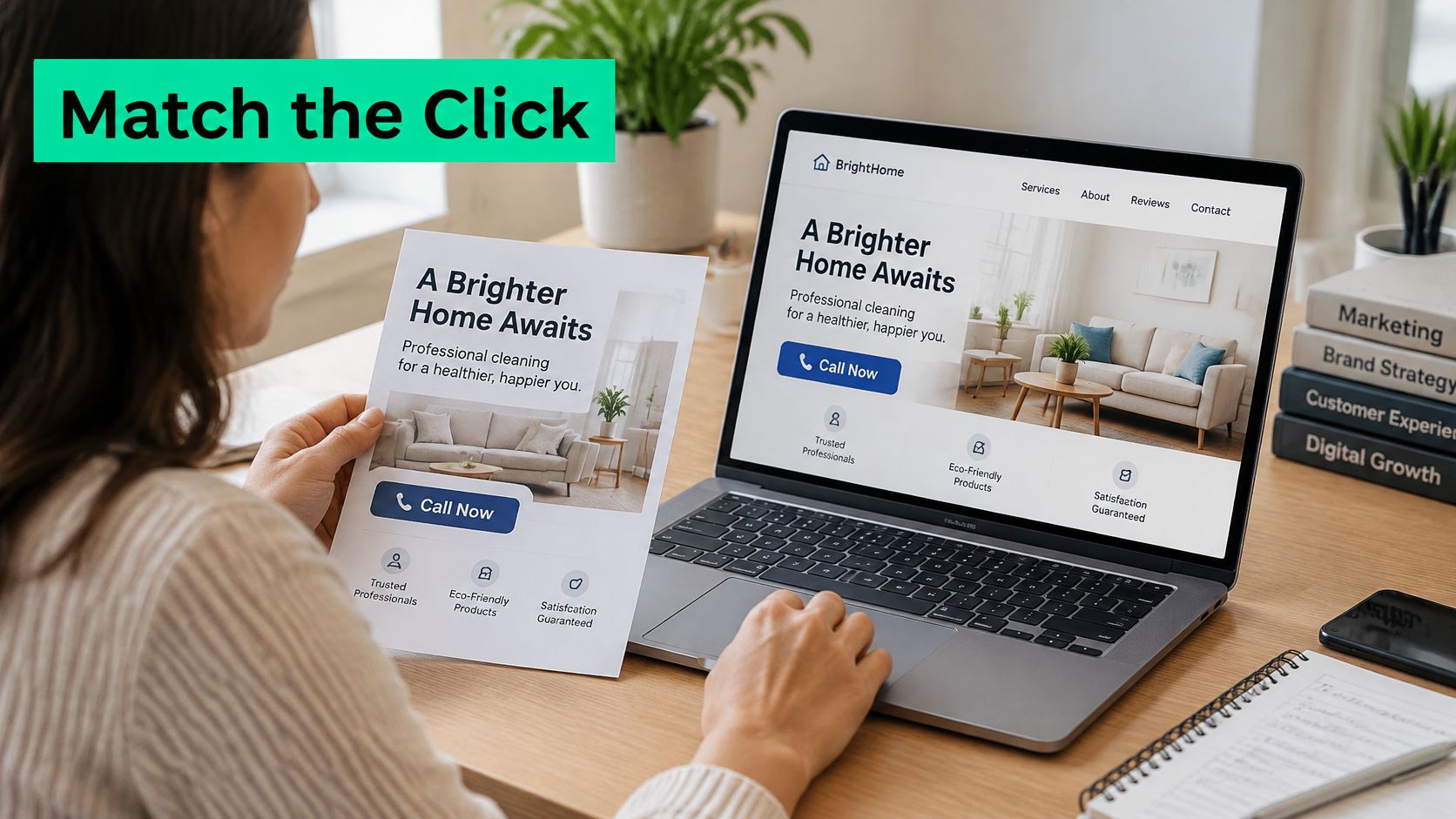
Your headline isn't a fresh start. It's a continuation of the ad. If the ad promised emergency AC repair in Dallas, the headline should say Same-Day AC Repair in Dallas. Under it, add one useful detail, such as a response time or the neighborhoods you serve. Then put a phone button where a thumb can reach it.
If the ad offers a free tax checklist for small firms, don't send people to a headline about general accounting services. Name that exact checklist. The visitor should think, "Good, this is the thing I clicked for," without having to hunt for it.
Say a bakery runs an ad for same week wedding cake tastings. The page headline should promise the tasting, name the city, and make booking the next step. It shouldn't open with the bakery's full history, a menu, and five links to other pages.
A simple headline checklist
- State the outcome: Tell the visitor what they'll get, not what your company does in general.
- Name the audience: "For Dallas homeowners" or "for small law firms" removes doubt fast.
- Keep it short: Keep the main line under about 12 words so it can be read at a glance.
- Add one concrete detail: Use the subheadline for response time, service area, price starting point, or what happens next.
This short video is useful to watch while you compare your ad wording with your page headline.
One button, written as the next step
Use one primary call to action per page. Write it as the visitor's next step, not as a company chore. "Get the free audit" and "Call now" tell a person what happens when they tap. "Submit" tells them nothing and sounds like paperwork.
You can repeat that same button after the offer and again at the end of the page. Repetition is fine. Competing choices aren't. Menus, extra links, and side offers all compete with the button, so remove them or mute them on paid traffic pages. If everything shouts, nothing is clear.
Keep one primary call to action and write it for the visitor's next step rather than for your company.
Trust Signals That Remove Doubt Before the Form
Right before the form, most visitors pause. They're asking two questions. Will this company deliver? And is it safe to share my details? Your proof has to answer those questions at that exact moment, not three screens earlier.
Use proof that's specific. Show a client result with a number and a time frame. Show star ratings with the review count, because what customer reviews are matters less than whether the rating looks real and recent. List licenses, certifications, or memberships. Show client logos only with permission. A short three or four step process also helps, because people relax when they know what happens after they click.
Match the proof to the worry
A law firm page needs case results and attorney credentials, because the visitor is worried about competence. A local repair page needs a license number, a response time, and reviews from nearby customers, because that visitor is worried about letting a stranger into the house. The proof is different because the worry is different.
Place the strongest proof beside the button or form. A bare button that says "Request service" asks for trust. The same button beside "4.9 stars from 312 reviews" earns a little of it. That's why placement matters as much as the proof itself.
Leave out fake urgency, unsupported claims, and stock photos dressed up as testimonials. People can spot them, and once they doubt one claim, they doubt the rest of the page.
Baymard's benchmark of major US and European e-commerce sites found that 65% of sites had mediocre or worse checkout usability, and its usability research indicates design improvements alone can produce an average potential conversion rate increase of about 35% for large e-commerce sites. That's checkout data, not a lead generation benchmark. Treat it as a directional lesson. Unresolved uncertainty and avoidable friction suppress completion. Test proof in two positions, then compare qualified lead rate, not just clicks.
Form Length and Mobile Design That Keep Visitors Moving
Every field is a small decision. Do I want to type this? Do I even know the answer? Add enough small decisions and people quit, even when they wanted the offer.
Based on an analysis of 404 landing pages published by Neil Patel, in 2024 one field forms converted at 18.2%, compared with 4.2% for forms with nine or more fields.
| Form length | Conversion rate | Source |
|---|---|---|
| One field | 18.2% | Neil Patel, 2024 (404 landing pages) |
| Nine or more fields | 4.2% | Neil Patel, 2024 (404 landing pages) |
Ask only for the next step
For most service pages, you need a name, a business email or phone number, and one context field. That context field might be the service needed or the property type. You can collect the rest later, after a real conversation has started. Asking for everything up front feels thorough to you and exhausting to the visitor.
Shorter isn't always better, though. A form with no qualifying question can fill your inbox with weak leads. You'll get more submissions and fewer real buyers. Judge the form on qualified leads, not just completions. That's also why form design belongs with SEO friendly website design, because a page that ranks but can't capture a lead cleanly wastes the visit.
Mobile input rules
Baymard's mobile checkout forms research found that 94% of sites in its mobile checkout study did not consistently identify required and optional fields, 60% lacked formatting examples or input masks where multiple formats were possible, and 65% created privacy concerns by requesting information such as a phone number without explaining its use. These figures come from checkout research, so treat them as a directional lesson for lead forms.
- Label every field: Mark required and optional fields clearly, in words a person can see.
- Show the format: Give an example for phone numbers and dates so people don't guess wrong.
- Open the right keyboard: Use a number pad for phone fields and an email keyboard for email fields.
- Use one column: Let autofill work, and explain why you need a phone number before you ask for it.
A working rule: Shorten the form, watch lead quality for two weeks, and keep the version that produces the most qualified leads.
Examples by Traffic Source and Common Misconceptions
A landing page works like a good store clerk. The greeting changes depending on how the customer walked in. Someone who asked for a specific product gets pointed straight to the shelf, while someone who wandered in off the street needs a little more orientation first. Your traffic source tells you which visitor just arrived, so match the page to that one source and that one intent. This graphic breaks down how the message and the action shift by channel.
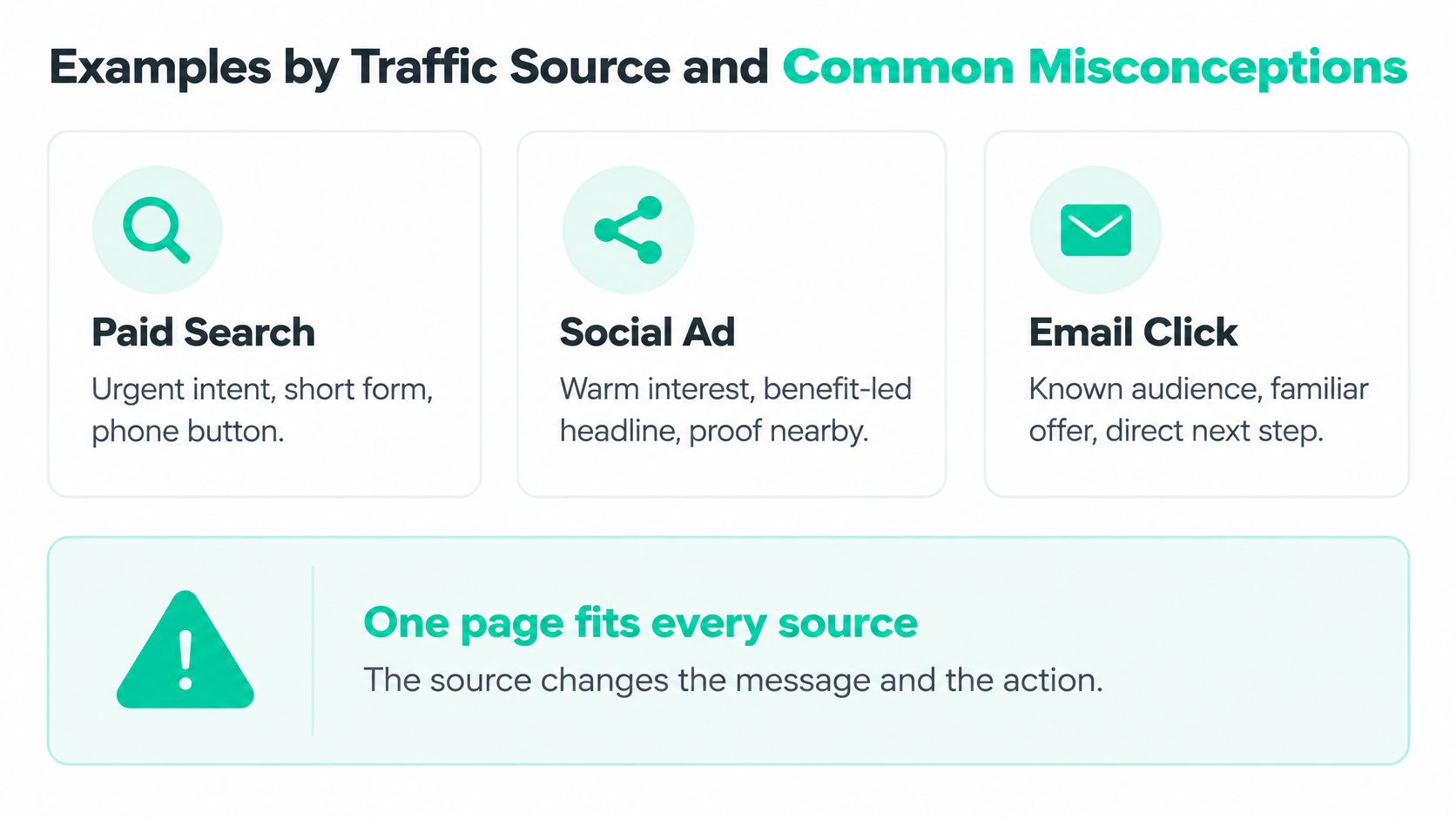
A paid search page for an urgent service should match intent right away. The headline repeats the search, the form stays short, and a phone button sits near the top. That visitor doesn't need a brand story. They need help now.
A social ad page for a course needs more warming up. A short video and a longer explanation can come before the form, because that visitor was scrolling a minute ago. A local service page should lead with a phone first call to action and proof of the service area. Nearby reviews matter more than national claims.
Device matters as much as channel. Mobile visitors often convert below desktop visitors even when the layout resizes correctly, so responsive design alone doesn't guarantee equal mobile conversion. A page can fit the screen and still be hard to use with one thumb while someone is distracted on a bus or between meetings.
Two myths to drop
Myth one, every page should look the same. It shouldn't. One template for every source forces every visitor through the same amount of explanation, whether they need it or not. The urgent searcher waits while the curious scroller gets rushed, and both convert worse.
Myth two, stripping all navigation always helps. Sometimes visitors need reassurance before they contact a business. Removing every link and shortening every form can hurt your qualified lead rate if people leave to check you out elsewhere and never come back.
AI referrals add a newer wrinkle. A 2025 analysis covered by WebFX on gen AI search trends reported a 15.9% conversion rate for Perplexity referrals versus 9.77% for organic search, although results varied substantially by industry. Only about 7% of AI sessions landed on homepages, while most entered two or three levels deeper. So deep service and comparison pages need their own context, proof, and next step. Segment AI traffic in analytics before you assume it converts better for you.
- Do report conversions by device, channel, campaign, and lead quality.
- Don't optimize for raw form completions when qualified opportunities are what pay the bills.
Optimization Checklist and Page Diagnosis
Before you launch, walk the page like a first time visitor on a phone. This photo captures the kind of slow, item by item check that catches problems early.
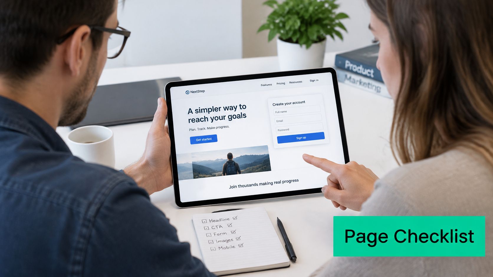
Pre launch checklist
- One primary call to action: The same next step appears at the top, after the offer, and at the end.
- Headline match: The headline repeats the promise in the ad or link, in plain words.
- Proof beside the button: A rating, result, or credential sits where doubt is highest.
- Short form: The form only asks for what the next step needs, with required fields labeled and format examples shown on mobile.
- Phone layout ready: A click to call button sits near the top, and load time is tested on a real phone.
- Clean tracking: Your reports separate button clicks from completed leads and qualified leads.
At Assertive Agency, we build fast, focused landing pages that turn ad clicks into leads, so this check is where we start before we change anything else.
| Symptom | Likely cause | First fix |
|---|---|---|
| Clicks but few form starts | Headline does not match the ad | Repeat the ad's exact promise in the headline |
| Visitors leave before scrolling | Slow load or heavy hero image | Compress media and test load time on mobile |
| Forms started but not finished | Too many or unclear fields | Remove optional fields and label required ones |
| Form fills look normal but sales stay low | Low-intent traffic or vague offer | Add a qualifying question and track lead quality |
| Calls are low on mobile | Phone number hidden or unclear | Place a click-to-call button near the top |
Fix one stage at a time
- Pull the last 30 days of data by source and device.
- Find the weakest stage, whether that's the click, the read, the trust point, or the form.
- Fix that one stage, starting with headline match, then proof placement, then form length, then page speed.
- Retest for two to four weeks and judge the result on qualified lead rate and revenue per session.
If you change five things at once, you won't know which one worked. This week, audit your highest spend paid landing page against the checklist above and fix the first stage it fails.
If your ads are getting clicks but your pages aren't turning them into calls and qualified leads, we can rebuild the page around one source, one promise, and one clear next step. Assertive Agency builds landing pages for Google Ads and Meta Ads campaigns, with speed, proof, and form tracking set up from the start. Visit Assertive Agency to talk through your highest spend page and what to fix first.
