


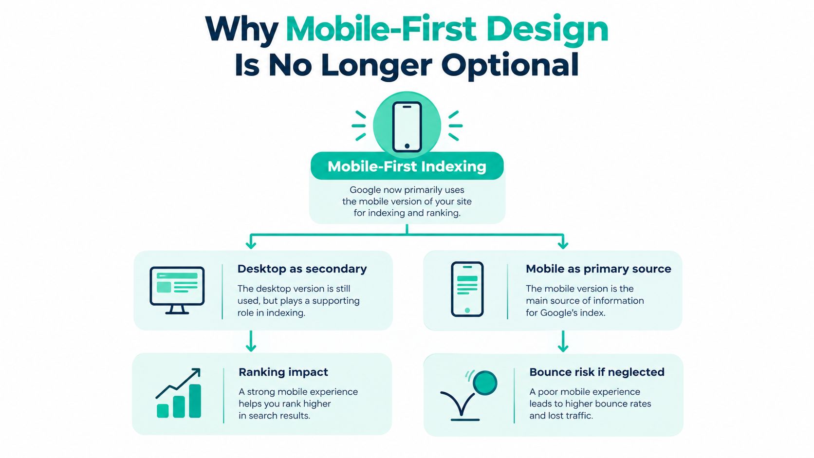
Google now uses the mobile version of a page as the primary version for indexing, so responsive design is a foundational search requirement, not just a usability preference. A page should aim for LCP of 2.5 seconds or less, INP under 200 milliseconds, and CLS of 0.1 or less to meet Google's “good” Core Web Vitals thresholds.
A business owner often discovers the problem after a redesign goes live. The desktop site looks polished, the homepage has impressive animation, and the marketing team expects more leads. Then a customer opens the site on a phone, can't find the service menu, waits for a form to respond, or lands on a page where the key offer never appears. Search visibility and conversion performance suffer from the same design decisions.
SEO-friendly website design treats crawling, rendering, usability, accessibility, and revenue as one system. The strongest sites do more than add keywords to attractive pages. They make important information available to Google and customers, keep key interactions responsive, and guide visitors toward a useful next step.
Table of Contents
- Why Mobile-First Design Is No Longer Optional
- Understanding Core Web Vitals and Page Speed
- Building Search-Friendly Information Architecture
- Implementing Structured Data for Rich Results
- Designing for AI Search and Modern Discovery
- Balancing Performance with Conversion Goals
- When to Handle SEO Design Yourself Versus Hiring Help
Why Mobile-First Design Is No Longer Optional
Google's mobile-first indexing changed the starting point for website design. The search engine primarily uses the mobile version of a page for indexing and ranking, and Google completed its transition to mobile-first indexing by July 2024 (Google's mobile-first indexing guidance). A desktop layout can still matter to visitors, but it can't be the only place where the business presents its best content.
Build content parity before visual polish
A responsive implementation should serve substantially equivalent content and metadata on mobile and desktop. That includes:
- Service copy: The mobile page shouldn't remove eligibility details, coverage areas, pricing context, or important qualifications.
- Internal links: Mobile navigation and page content should expose crawlable links to related services, locations, resources, and contact paths.
- Structured data: Mobile and desktop versions should contain the same structured data, as explained in Google's mobile-first indexing documentation.
- Technical access: The page needs a responsive viewport configuration, accessible text, usable images, and HTML that can be rendered without depending on hidden desktop-only elements.
An HVAC company might show its full service list on desktop but collapse it into a JavaScript-only menu on mobile. A law firm might display attorney credentials and case information on desktop while hiding them behind an inaccessible carousel on a phone. In both cases, the mobile omission creates a search problem and a trust problem.
Practical rule: Design the smallest screen journey first, then expand the layout for larger screens. Don't shrink a desktop design and call it mobile-first.
Mobile visitors often discover local services, retailers, and professional firms while standing in a driveway, comparing providers, or looking for a phone number. A clear phone link, readable service description, and visible location information can matter as much as the hero image. Responsive design therefore supports search representation and the moment when a visitor decides whether to call, book, or leave.
Understanding Core Web Vitals and Page Speed
A service page can look polished and still lose leads because its main image loads late, its quote form freezes, or its layout shifts while a visitor tries to tap. Core Web Vitals separate those problems into three measurable experiences, using field data generally reported at the 75th percentile over a rolling 28-day period (Google's Core Web Vitals documentation).
| Metric | Good | Needs Improvement | Poor |
|---|---|---|---|
| Largest Contentful Paint, LCP | 2.5 seconds or less | 2.5 to 4 seconds | Above 4 seconds |
| Interaction to Next Paint, INP | Under 200 milliseconds | 200 to 500 milliseconds | Above 500 milliseconds |
| Cumulative Layout Shift, CLS | 0.1 or less | 0.1 to 0.25 | Above 0.25 |
LCP measures when the largest visible content appears. Oversized hero images, slow server responses, blocking CSS, and late-loading fonts can delay the service promise a visitor came to read. INP measures responsiveness after interaction. Long JavaScript tasks and excessive third-party scripts can make a menu, form, filter, or booking tool feel broken. CLS measures unexpected movement, often caused by images, ads, embeds, or interface elements without reserved space.
Use these metrics as acceptance criteria for every template, not as a score checked after launch:
- Media delivery: Serve correctly sized modern images, and preload only the primary above-the-fold asset.
- Rendering priority: Prioritize critical CSS and defer JavaScript that does not support the first interaction.
- Interaction handling: Break up long tasks so navigation, forms, and booking controls respond promptly.
- Layout stability: Set dimensions or aspect-ratio values for images, video, ads, and embedded tools.
Performance decisions also affect revenue. Removing every script may improve responsiveness but eliminate appointment tracking, chat, or payment functionality. The practical choice is to keep tools that support a measurable business action, load them after primary content where possible, and replace scripts that delay a lead form without producing useful conversions.
A 2026 analysis using Chrome User Experience Report data found that 49.1% of mobile web origins and 58.0% of desktop origins passed all three Core Web Vitals across 13.75 million origins (Core Web Vitals pass-rate analysis). Mobile performance remains an opportunity, although passing these metrics does not guarantee strong rankings. Relevance, content quality, links, and other technical factors still affect search visibility.
Test in the lab during development, then verify field data in Search Console. Review more than the desktop homepage. Check the mobile service template, the quote form, and the interaction that produces a lead. Free SEO audit tools for technical checks can help find issues before a redesign makes them expensive to reverse.
Building Search-Friendly Information Architecture
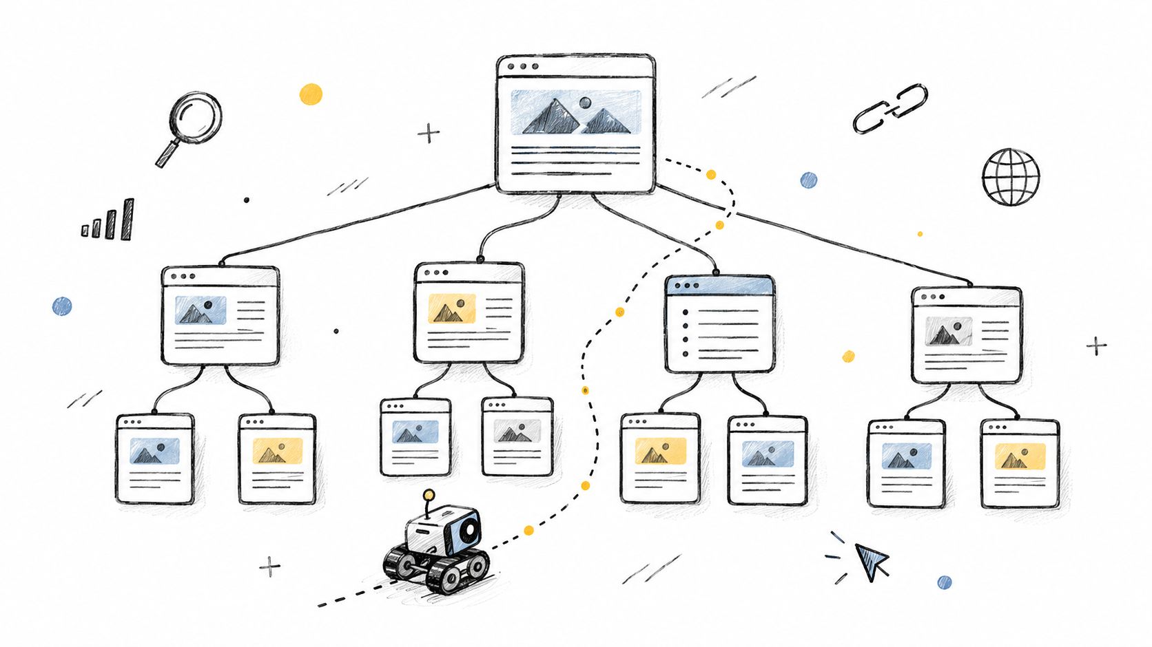
An HVAC company can lose qualified leads when its site hides services inside one broad page. A “Services” page that mixes heating, cooling, ductwork, emergency repair, and maintenance gives search engines and visitors little direction. Separate pages for each major service, descriptive internal links, and clear service-area information create paths that support both discovery and contact decisions.
Each page should answer a distinct customer need. A visitor looking for emergency furnace repair should reach relevant proof and a booking option without sorting through generic copy.
Give every important page a purpose
For a local service business, map the architecture to real customer journeys:
- Core services: Create separate pages for work with distinct search intent, such as emergency repair, installation, or maintenance.
- Service areas: Publish location pages only where the business operates and can provide useful local information.
- Proof pages: Link case studies, testimonials, certifications, and team pages from the services they support.
- Conversion paths: Connect contact, quote, booking, or consultation pages in relevant copy instead of hiding every option in the footer.
A criminal defense firm needs more than a “Practice Areas” page. Separate pages for DUI defense, federal charges, and another defined service can address different questions when each contains original, useful information. Near-identical city pages create clutter, weaken user trust, and make it harder to identify the primary page.
Use headings that state the page subject, readable URLs, and anchor text that names the destination. “Emergency furnace repair” gives more context than “learn more.” Navigation should expose important pages directly. Decorative menus and repeated clicks can reduce both crawl access and completed inquiries.
Internal links should support discovery and revenue together. A service page can point customers to a preparation guide, a proof page, and a contact form. A blog post can link to the service it explains. Before implementation, confirm that every link reflects a genuine relationship. Breadcrumb, Product, and VideoObject markup are priority types when a team has to choose where to start (Google's structured data feature guide). The result is a clearer journey, not a collection of isolated SEO signals.
Implementing Structured Data for Rich Results
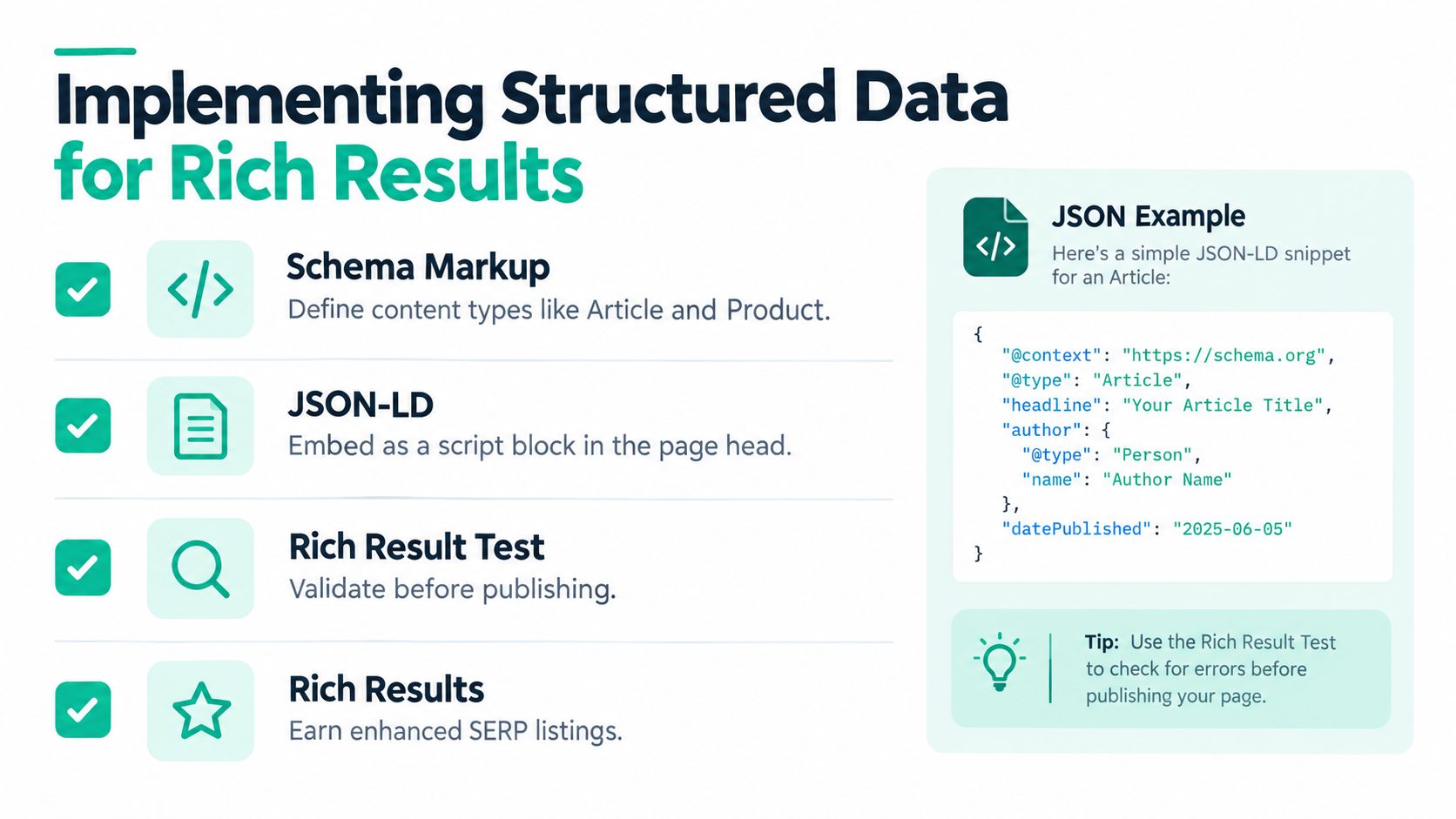
Structured data adds a machine-readable description of what a page contains. Google says it can help search engines classify content and make eligible pages display richer results, but it doesn't repair weak copy, inaccessible content, or incorrect claims (Google's structured data introduction).
Match the markup to the visible page
The implementation should begin with the page's primary entity:
- Product: Use Product markup on a product detail page where price, availability, and other required information are visible.
- Article: Use Article markup for an editorial page with clear article content and authorship.
- LocalBusiness: Use an appropriate local business type when the page represents a real business and its name, address, and service details are visible.
JSON-LD usually fits well in a reusable CMS component because the template can draw values from the same source as the visible page. When inventory, pricing, reviews, or location details change, the HTML and JSON-LD should change together. A business shouldn't mark up a rating that users can't see or add a price that doesn't match the offer.
Validate before deployment
A practical release process is simple:
- Choose the schema type that matches the page.
- Include every required property for the relevant rich-result feature.
- Confirm the values match visible content.
- Test the page with Google's Rich Results Test.
- Monitor structured-data reports in Search Console.
Breadcrumb, Product, and VideoObject markup are priority types when a team has to choose where to start (Google's mobile implementation guidance). Rich-result eligibility can improve how a listing appears, but Google doesn't guarantee that enhanced presentation will show. The business still needs a crawlable page, useful information, and a clear reason for a searcher to click.
Designing for AI Search and Modern Discovery
Google states that pages don't face extra technical requirements for appearing in AI Overviews or AI Mode. They still need to be indexed and eligible for normal Search, with crawlable content, useful page experience, appropriate internal links, and structured data that matches visible text (Google's guidance for AI features).
That changes the design question. A business doesn't need secret AI markup or a separate keyword-stuffing playbook. It needs pages that make important facts easy to find, verify, and connect.
Make the page extractable without making it robotic
A service page should state its main offer near the top, then answer the qualifications that determine whether a visitor is a fit. For a roofing contractor, that might include service type, coverage area, property limits, emergency availability, and the next contact step. For a software provider, it might include the audience, core capability, integration limits, and support model.
Those facts shouldn't exist only inside an image, animated counter, or decorative tab. Use visible text, descriptive headings, clear authorship, evidence, and contextual links. Keep business name, address, services, product information, and pricing details consistent across templates.
A page built for accurate extraction is usually easier for a person to scan. Clear claims help both audiences, while hidden qualifications create confusion for both.
Conversion design still matters. The answer can appear beside a concise form, a phone action, or a booking button. The aim isn't to remove persuasion. It is to place proof and limitations where users and search systems can interpret them without guessing.
Balancing Performance with Conversion Goals
A fast site that removes the quote form isn't a successful site. A polished site that loads five chat, analytics, personalization, and booking scripts before a visitor can tap the menu isn't successful either. The right choice depends on which interaction produces value and when the visitor needs it.
Interaction to Next Paint replaced First Input Delay in March 2024, and a good INP is 200 milliseconds or less. An available analysis reports that roughly 30% of mobile sites score poorly on INP, with blocking JavaScript tasks a common cause (INP study and analysis).
Rank scripts by business value
A mobile journey for an auto repair shop might need navigation, a call button, a quote form, analytics, consent controls, and chat. They don't all deserve the same loading priority.
- Protect lead actions: Keep navigation, forms, phone links, and booking controls responsive.
- Delay optional assistance: Load chat after an intent signal, such as a visitor opening the contact area or spending time on a service page.
- Question decorative scripts: Sliders, cursor effects, video backgrounds, and animated counters should justify their impact on the main thread.
- Measure real journeys: Test menu opening, form typing, validation, date selection, and submission on real mobile devices.
DIY optimization often stops at image compression. That helps loading, but it won't fix a booking widget that blocks the main thread. A professional implementation can profile scripts, split long tasks, and protect the conversion path while retaining necessary functionality. The business shouldn't remove every third-party tool automatically. Each one should earn its place through useful measurement, qualified leads, customer support, or revenue.
Teams evaluating landing pages should also check common landing page optimization mistakes because a technically responsive page can still bury its offer or make the form unnecessarily difficult.
When to Handle SEO Design Yourself Versus Hiring Help
The common assumption is that SEO-friendly design means buying a fast theme, adding a plugin, and publishing pages. That can work for a small site with a narrow offer, but it breaks down when templates, tracking, structured data, migrations, and conversion paths interact.
A DIY approach makes sense when the business has a small number of pages, a stable CMS, someone who can edit HTML or templates safely, and enough time to test mobile behavior. The work should start with content parity, clear navigation, responsive templates, accessible contrast, stable media dimensions, and field-data monitoring.
Use a decision based on risk
DIY is a reasonable fit when:
- The site is simple: A focused service business can improve headings, links, copy, images, and contact paths without rebuilding the entire platform.
- The team can test: Someone needs to check real mobile interactions, forms, redirects, structured data, and Search Console reports.
- Changes are reversible: A staging environment and backups reduce the cost of a mistake.
Outside help becomes more practical when:
- Revenue depends on the site: A redesign affects many service pages, products, locations, forms, or booking flows.
- The platform is complex: WordPress, Shopify, headless systems, plugins, and third-party tools can create issues that aren't visible in the page editor.
- The site is migrating: URL changes, rendering differences, internal links, metadata, and structured data need coordinated review.
- The team lacks implementation time: A technically correct plan has no value if nobody can deploy and monitor it.
Accessibility also belongs in the decision. WCAG 2.2 sets a minimum contrast ratio of 4.5:1 for normal text and 3:1 for large-scale text (WCAG 2.2 requirements). It also defines a minimum pointer target size of 24 by 24 CSS pixels, with a stricter 44 by 44 CSS-pixel criterion at Level AAA (WCAG 2.2 target-size guidance). These are design and usability requirements, not decorative extras.
The expensive option isn't always hiring help. Sometimes it's launching a redesign without anyone accountable for search, accessibility, and lead flow.
Assertive Agency is one USA-based option for businesses that need website design, technical SEO, responsive UX, speed optimization, landing pages, and lead-capture systems handled together. Before choosing any provider, business owners should compare technical depth, reporting, implementation ownership, ongoing maintenance, and the ability to connect search work with revenue. This guide to choosing a digital marketing agency offers a practical way to assess those differences.
A sensible first move is an audit that identifies mobile omissions, Core Web Vitals issues, unclear page relationships, inaccessible interactions, and conversion friction. Small businesses can then fix the highest-risk templates first, while larger organizations may need a coordinated redesign and monitoring plan.
Assertive Agency helps USA businesses connect responsive website development, technical SEO, Core Web Vitals work, content structure, and conversion-focused landing pages. Visit Assertive Agency to request an initial audit and identify the design changes most likely to improve crawlability and lead flow.
